The Art of Colour: Crafting the Perfect Palette to Tell Your Brand’s Story
Surface Pattern design colour palette magic
Colour isn’t just a finishing touch, the piece at the end to fill in the blanks — it narrates your whole story. It sets the tone, stirs emotion, and connects people to your brand before they’ve read a single word. Whether you're a well established brand looking for that unique touch, a maker designing your next product line or a small business shaping your visual identity, colour is your silent ambassador; that quiet force that draws people to you and holds them captivated.
As a surface pattern designer, I work with colour daily. It’s one of the most exciting (and often overwhelming) parts of the creative process — but when you get it right, it’s magic.
🎨 Why Colour Matters
Have you ever felt instantly drawn to a product because of its colours? That’s not an accident. Colour influences our perceptions and feelings, our moods and our attraction— it can create trust, excitement, calm, or even nostalgia. In branding and product design, your palette is a powerful tool for communicating who you are and what you stand for.
A warm, earthy palette might suggest craftsmanship, heritage and sustainability. Bright, punchy hues might speak to playfulness, warmth and innovation and a more monochromatic palette evokes sophistication and glamour, Choosing the right colours can help your audience feel at home with and connected to your brand, without you needing to say a word.
🧠 Colour Psychology 101
Every colour tells a story, every hue evokes a mood,
Blue: Calm, trustworthy, professional
Green: Natural, fresh, calming (ever wondered why theatres have a green room)
Pink: Playful, romantic, creative
Yellow: Energetic, joyful, optimistic
Black: Elegant, bold, timeless
Orange: Friendly, vibrant, confident
Understanding colour psychology goes a long way to helping you choose hues that align with your values and appeal to your audience on a deeper level. Getting your colour story right will not only unify the look and feel of your brand, collection or product launch but will automatically start drawing in the audience you are wanting to speak to,
🧵 Finding Your Unique Palette
So how do you find a palette that feels just right? It can feel very overwhelming to start with; what even is "just right”. Have you ever heard of analysis paralysis? What’s the right answer, what if I pull the wrong colours…………I would say a big so what to all of that; at this point you’re not making irreversible decisions; you’re playing.
Pull inspiration from surroundings, destinations, wardrobe pieces, or even vintage references. Once you’ve gathered a few colours, start to play with different combinations to see what works together — contrast, harmony, and a mix of warm and cool tones can help you strike the perfect balance.
Your emotional responses will lead you. Pull some colours, see how you react; does it feel like it resonates. If it doesn’t switch colours in and out until it starts to tell your story. You’ll only know once you start trying.
Once you have a starting set of 5-8 colours then you can start refining, Start to place that palette hypothetically in front of your target audience; as some questions of yourself:
What emotions do I want people to feel when they see my brand?
What colours do I naturally gravitate toward?
What colours and trends does my target audience already connect with?
Who is my audience, and what colours resonate with them?
Where do I want my target audience to use my end product and how will my colour palette influence that?
🔁 How I Use Colour in Surface Design
In my work at Krafty Chameleon, colour is at the heart of every pattern and collection. I love to play with colour, combine the unexpected and bring things together in a non conventional way. I often start with a mood or memory — the dusky golds of a summer sunset, the muted soft palette of a vintage cottage or the vibrance and energy of Indian festivals — and I build a palette from there. For me the emotion and energy of colour bring life to my surface patterns. It’s not just the bit that fills in the spaces but the life force that gives them their place in the world.
The same palette can feel completely different depending on how it’s used. A dusty rose might feel romantic in a floral but bold and modern when paired with black geometrics. That’s the beauty of working with colour — it has a thousand stories to tell.
Once I have finalised a palette for a collection I then think about subdividing it into different colour stories within itself. Think of them as chapters in a book; all a part of telling the overall story but each one a mini tale in itself. These separate palettes within a palette are then the starting point for each pattern within a collection. Each one individual with its own personality but part of telling a complete and cohesive overall story,
🧰 Tools & Tips for Experimenting
If you're ready to start crafting your own palette, here are a few tools and tricks:
Coolors.co or Adobe Color for building and testing palettes
Try limiting yourself to 3–5 colours to start — simplicity often creates cohesion
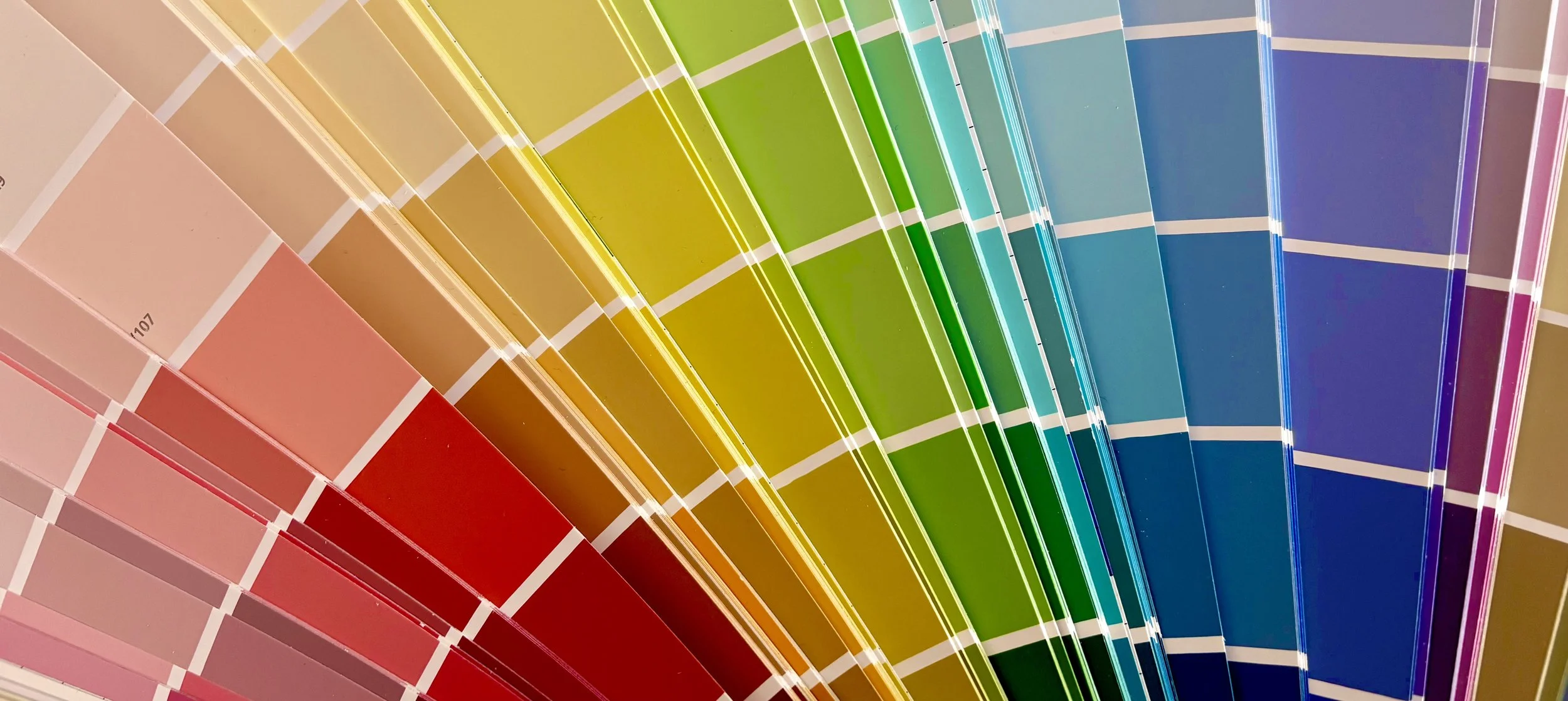
Use paint colour charts as an inexpensive way to play with colour combinations. They contain a range of hues and tints and are simple to carry around and test in different lights and alongside different colours.
Don’t forget neutrals! They can help your colours breathe, add contrast for the eye to rest on and add sophistication
💬 Let's Bring Your Colours to Life
Your brand has a story, and colour will help you tell it in the most natural and emotive way. Whether you're designing products, packaging, or a whole visual identity, finding the right palette will bring clarity and cohesion to everything you do.
And if you're feeling a little colour-shy? I’m here to help. Choosing palettes is one of my favourite creative challenges — and I’d love to collaborate.
🌈 Connect with me to chat creative journeys, colour palettes, or potential projects: rachelanne@thekraftychameleon.com

Colour Palette Inspiration from around the world