How to Mix Patterns: Tips for Confidently Combining Prints Like a Pro

Wallpaper, home decor, colour and pattern mixing ideas. Based on a starting point of Art Deco.
Mixing patterns can feel like stepping into uncharted territory — exciting, bold, and just a little terrifying. If you’ve ever admired a layered, vibrant look but felt unsure about trying it yourself, you’re not alone. The truth is, even seasoned makers and designers can feel intimidated by the idea of combining prints.
But when done well, pattern mixing becomes pure magic — a way to express personality, create depth, and make your products, packaging, or spaces truly unforgettable.
Let’s explore how to mix patterns with confidence, creativity, and a dash of chameleon flair.
😰 Why Pattern Mixing Feels Intimidating (and How to Push Past It)
If you’ve ever thought, “This looks amazing, but I could never pull it off,” you’re not alone. Many creators fear mixing patterns will look too chaotic, too busy, or just… wrong. Its all too easy to look at a spectacular piece of pattern mixing and think I don’t even know what they’ve done to make that work; the thought of being able to find success can be overwhelming.
Here’s the good news: like any design skill, it’s all about understanding a few simple principles — then practicing until it feels instinctive.
Remember: bold pattern combinations are everywhere in the commercial world. Think of Anthropologie’s layered homeware, Gudrun Sjödén’s vibrant fashion, or Liberty’s print-on-print styling. If they can do it, you absolutely can too.
✨ Start with These Key Principles
1. Scale is Your Best Friend
Pair patterns of different sizes to create balance. For example:
Large florals + small polka dots
Bold stripes + tiny geometrics
Too many large prints can compete. Too many small ones can get lost. Contrast in scale creates clarity and harmony.
2. Stick to a Colour Palette
Choose 2–4 shared colours across your patterns. This creates cohesion, even when the styles are wildly different.
Tip: Try working with one of your brand palettes or pulling tones from a key product.
3. Mix Pattern Types, Not Just More of the Same
A variety of pattern styles keeps the look dynamic:
Florals
Stripes
Abstracts
Geometrics
Textures (like dots, linen effect, brush strokes)
Think of each as a different “voice” in a conversation. A good mix keeps things interesting — not overwhelming.
🏠 Where Pattern Mixing Shines (Real-World Inspiration)
Pattern layering isn’t just for maximalists — it’s everywhere in commercial design. Look at the combinations of fabrics inside hotel dining rooms, the combinations of patterns on different sides of tissue boxes or the linings of gentlemen’s jackets:
Home décor: Bedding sets that pair florals with gingham or paisley with spots
Fashion: Print dresses with contrast cuffs or patchwork-style patterns
Packaging: Brands like Rifle Paper Co. and Designers Guild create layered looks that tell a visual story
Product Design: Patterned linings, labels, tissue paper, and wrapping for that extra “wow” moment
If you sell handmade products or art prints, learning to style your designs with complementary patterns can instantly elevate your brand presentation.
🔍 What Not to Do
Let’s keep it real — here are a few common pattern-mixing mistakes:
Using clashing styles without intent (e.g., ultra-minimal meets wild 70s retro with no common link). There needs to be a point to what you’re doing for it to be successful and cohesive.
Letting everything compete for attention — aim for a “hero” pattern and supporting players; if everything is shouting the eye gets no peace and it can’t settle.
Ignoring negative space — busy prints need breathing room (think solid-colour buffers!)
Mixing too many patterns too soon — start with two and add more when you feel confident.
🛠 Quick Start: Try These Beginner-Friendly Combos
If you’re just dipping your toes into pattern mixing and want some ideas that will work fairly effortlessly, try:
Soft floral + tiny polka dot
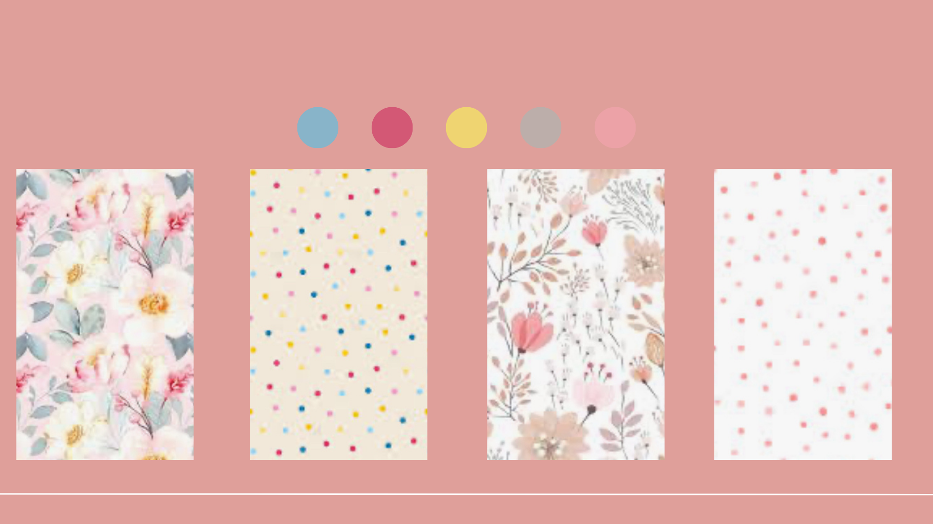
Soft floral and ditsy polka dot pattern mixing combinations
Toile and Stripes
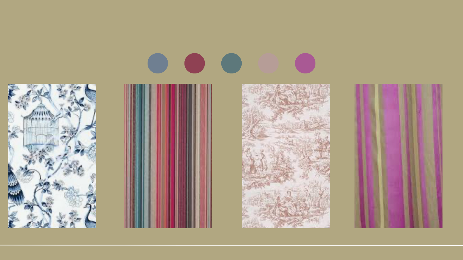
Toile and stripes pattern mixing combinations
Abstract brush strokes and organic line art
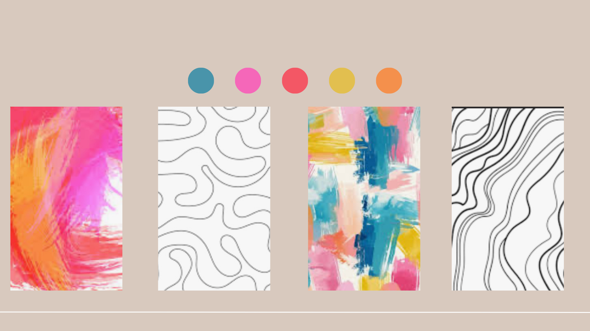
Abstract brush strokes and organic line art pattern mixing combinations
Two Tone gingham and Ditsy Print
You don’t need to reinvent the wheel when you’re starting out— just explore with intention and trust your eye. Find things that are successful and add a little bit of your character to them; maybe that’s your signature colour combinations or a theme that speaks to you and your work.
🦎 My Take: Patterns with Personality
At Krafty Chameleon, I design prints that are bursting with colour, character, and a sense of play. Whether you’re a maker styling product photos, a business packaging goods, or an interior designer elevating a space — I believe mixing patterns should be fun, expressive, and a little bit fearless. the interesting an unusual ideas appear right on the edge of all the ideas that don’t quite work. Its only by playing and finding what doesn't work that you uncover something different and brilliant.
You don’t need permission to play. Just a spark of inspiration, a colour story you love, and maybe a bit of chameleon courage.
💬 Why It’s More Than Just Pretty
Got a pattern combo you're unsure about or want advice styling prints in your work? Drop me a message — I'd love to help you mix with confidence.
🌈 Connect with me to chat creative journeys, colour palettes, or potential projects: rachelanne@thekraftychameleon.com