2026 Colour Forecast: What’s Trending in Surface Design
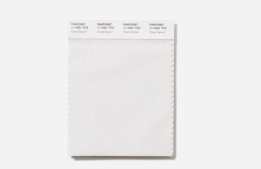
Pantone Colour of the Year 2026 - Cloud Dancer
Many creatives wait with anticipation for the release of the new colours of the year and trends for the coming seasons. Interested to discover what new inspiration they might find to re-touch patterns and rework collections with a new twist for the new trends.
The Pantone Colour of the Year for 2026 came as a surprise to many. Not because it was bold or controversial, but because it quietly challenged what we thought we needed next. Instead of leaning into the obvious or the expected, the bold and the energised the choice felt more reflective and emotionally nuanced rather than trend-led. For surface designers, it was a reminder that colour forecasting isn’t always about predicting what’s loudest on the horizon, but about noticing subtle shifts in mood, values, and how people want their spaces to feel. That unexpected direction has echoed across wider 2026 colour trend reports, shaping palettes that feel thoughtful, grounded, and surprisingly versatile.
The challenge now is how to use the peace and harmony of such a neutral colour to bring something new to portfolios in 2026
🎨 Colour as mood, not just fashion
Colour trends aren’t just about what looks good together, that’s perhaps a starting point but they should go deeper and connect with how we feel. Both as the artist working with them and the consumer viewing them.
As we move into 2026, surface design colour palettes appear to be reflecting a desire for comfort, optimism, and grounded beauty. The trends I’m seeing aren’t loud or fleeting or of a particular moment in time instead they are thoughtful, layered, and emotionally resonant. To me they are centred in a homage to nature, hints of earth tones with vintage twists. Muted but not dull, quiet but not boring.
🌿 Earthy foundations with refined depth
Alongside these grounded bases, there seems to be a growing confidence in brighter accents used in a considered manner alongside.
Think marigold instead of neon yellow, coral rather than hot pink, teal with depth instead of brightness. These colours act as punctuation marks rather than the whole sentence, used beautifully to ornament and accent the calm and the balance.
Dunn-Edwards have predicted exactly this approach in their interior decor paint trends and surface designers wouldn’t go far wrong to work some of this thinking into their own designs. Creating collections that would enhance and complement homes being redecorated with these trends in mind during 2026.
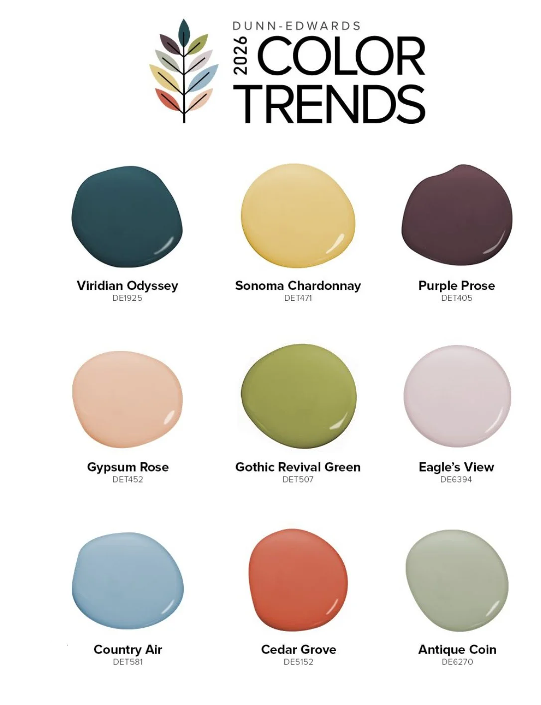
Dunn-Edwards Interior Design Colour Trends for 2026
Where will I be starting with these colour trend inspirations? I intend to rework some of my existing collections with a neutral palette and pick one or two of these punctuating colours to sing out in each collection.
🕊 Softer lights and modern neutrals
Creams, warm whites, pale stone, and chalky pastels are becoming more important now than ever. Not only are they playing a role in 2026 they are perhaps playing the starring role. Rather than being the balancing tones in a more vibrant palette they are to be the heroes in their own right, Front and centre with other tones worked around them.
They give the eye somewhere to rest and allow more complex patterns to breathe. In surface design, these lighter tones are doing a lot of quiet work and in 2026 that work will have a spotlight on it.
Think reimagined animal prints, calm geometrics, earthy florals and vintage cottage core ditsy prints. Almost a hark back to the days of Laura Ashley,
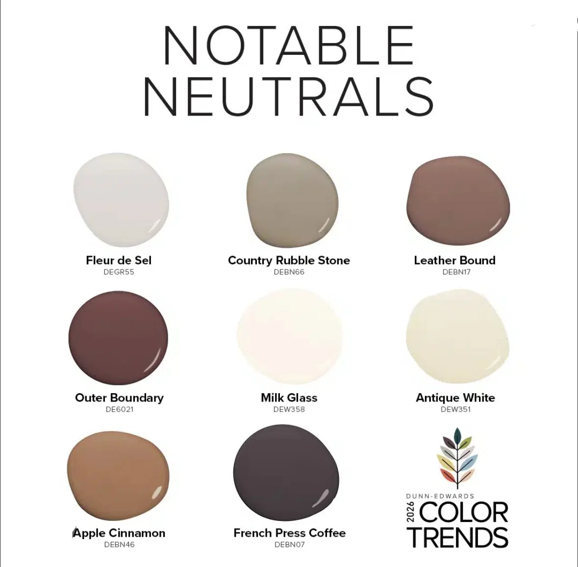
Dunn - Edwards 2026 Neutral Trends
🧵 Why this matters for pattern designers
Understanding colour trends isn’t just about chasing fashion it’s about knowing how your work might live in real spaces and making it relevant and appealing to art directors who have a keen eye for trends and fashions that fit with their brand story.
When palettes feel emotionally grounded, patterns become easier to place, easier to license, and easier for customers to imagine in their own homes. Cohesion through a collection and subtle links between patterns that make the eye link them, move freely between them and feel inspired to use them together in contrast and harmony.
🤍 Trusting your palette instincts
Trends are useful but its so important to remember they are not rules.
The most compelling colour work still comes from designers who understand their own artistic brand and visual language and can work with colour in a way that feels authentic to them and therefore connects more deeply with an audience.
Use trends as inspiration, a starting point or a new way of looking at a familiar subject matter but then filter that trend through your own creative lens. Even when working to a trend make sure that you are never dimming your creative voice. So be bold and brave going into 2026 and play with these more muted hero palettes and see what your inner voice allows to sing through,
Combining a trend with your voice as an artist; that’s where the real magic happens.
🌈 Connect with me to chat creative journeys, colour palettes, or potential projects: rachelanne@thekraftychameleon.com